Ever been frustrated with colorbars on your matplotlib plots that just totally mess with the layout of your figure? I plot a lot of image data, much of it in side-by-side comparisons, and the combination of matplotlib's default colorbar behavior and subplots was really getting up my nose. Here's how I finally got things looking right.
First the usual incantations for using matplotlib in the Jupyter Notebook:
%matplotlib inline
%config InlineBackend.figure_format='retina'
import numpy as np
from matplotlib import pyplot as plt
import matplotlib
When preparing plots for a paper, I collected some customizations to the matplotlib defaults to improve their appearance. Some (text.usetex, font size suggestions), I borrowed from this blog post by Nipun Batra. The use of savefig.dpi to make plots render larger in the inline backend while still using inches and points for sizes was figured out by Erik Tollerud.
# inspired by http://nipunbatra.github.io/2014/08/latexify/
params = {
    'text.latex.preamble': ['\\usepackage{gensymb}'],
    'image.origin': 'lower',
    'image.interpolation': 'nearest',
    'image.cmap': 'gray',
    'axes.grid': False,
    'savefig.dpi': 150,  # to adjust notebook inline plot size
    'axes.labelsize': 8, # fontsize for x and y labels (was 10)
    'axes.titlesize': 8,
    'font.size': 8, # was 10
    'legend.fontsize': 6, # was 10
    'xtick.labelsize': 8,
    'ytick.labelsize': 8,
    'text.usetex': True,
    'figure.figsize': [3.39, 2.10],
    'font.family': 'serif',
}
matplotlib.rcParams.update(params)
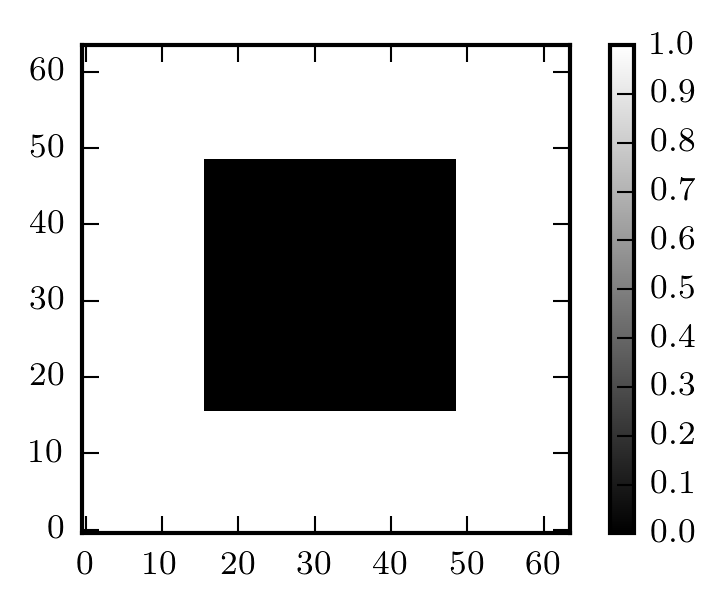
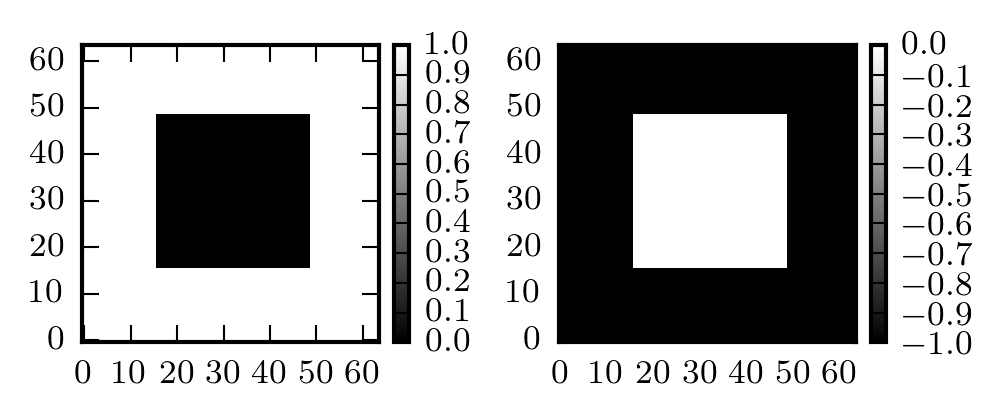
Since wonky colorbar sizes are most apparent with image plots (which force equal aspect ratio by default), let's make an image of a square.
data = np.ones((64, 64))
data[16:49,16:49] = 0.0
If you have a single Axes in your figure (i.e. no additional subplots), the colorbar auto-location logic works all right.
fig, ax = plt.subplots()
img1 = ax.imshow(data)
fig.colorbar(img1, ax=ax)
<matplotlib.colorbar.Colorbar at 0x10563e1d0>
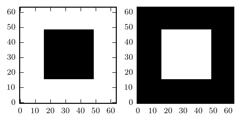
It's when you have subplots that things get weird. Let's plot this in a two-panel subplot.
fig, (ax1, ax2) = plt.subplots(ncols=2)

img1 = ax1.imshow(data)
img2 = ax2.imshow(-data)

plt.tight_layout(h_pad=1)
And now with colorbars...
fig, (ax1, ax2) = plt.subplots(ncols=2)

img1 = ax1.imshow(data)
fig.colorbar(img1, ax=ax1)

img2 = ax2.imshow(-data)
fig.colorbar(img2, ax=ax2)

plt.tight_layout(h_pad=1)
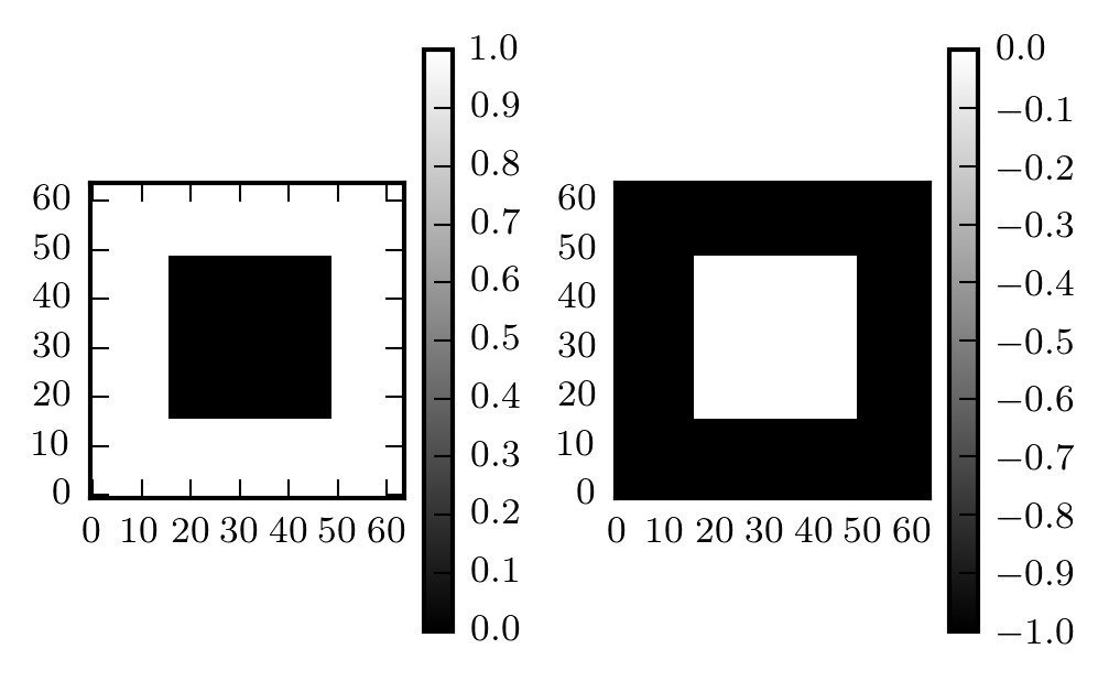
Anyone who's used image plots with colorbars in matplotlib has probably seen something like the above figure. We'd like for the colorbar to be the same height as the image, but the image is constrained to have equal width and height. One solution is Axes.set_aspect with the argument 'auto':
fig, (ax1, ax2) = plt.subplots(ncols=2)

img1 = ax1.imshow(data)
fig.colorbar(img1, ax=ax1)
ax1.set_aspect('auto')

img2 = ax2.imshow(-data)
fig.colorbar(img2, ax=ax2)
ax2.set_aspect('auto')

plt.tight_layout(h_pad=1)
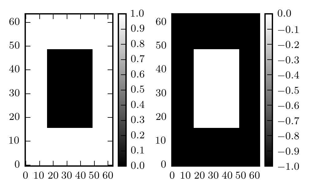
But now our square isn't square!
The real solution is buried in the matplotlib documentation for the axes_grid1 matplotlib toolkit that includes helpers for displaying grids of images. There's a lot you can do with it, but we're interested in the example of a "colorbar whose height (or width) [is] in sync with the master axes".
You use the make_axes_locatable helper to get an axes divider for the axes you're plotting your image in, and then you use the append_axes method to create your colorbar axes.
Here's the trick applied to the above example:
from mpl_toolkits.axes_grid1 import make_axes_locatable

fig, (ax1, ax2) = plt.subplots(ncols=2)

img1 = ax1.imshow(data)
divider = make_axes_locatable(ax1)
cax1 = divider.append_axes("right", size="5%", pad=0.05)
fig.colorbar(img1, cax=cax1)

img2 = ax2.imshow(-data)
divider = make_axes_locatable(ax2)
cax2 = divider.append_axes("right", size="5%", pad=0.05)
fig.colorbar(img2, cax=cax2)

plt.tight_layout(h_pad=1)

It's a bit tedious to do all that every time you want to add a colorbar to an image subplot, so you can wrap it up in a function:
def colorbar(mappable):
    from mpl_toolkits.axes_grid1 import make_axes_locatable
    import matplotlib.pyplot as plt
    last_axes = plt.gca()
    ax = mappable.axes
    fig = ax.figure
    divider = make_axes_locatable(ax)
    cax = divider.append_axes("right", size="5%", pad=0.05)
    cbar = fig.colorbar(mappable, cax=cax)
    plt.sca(last_axes)
    return cbar
Now you just call colorbar(thing) when you want to make a colorbar.
Updated December 12, 2019: Thanks to Mike Lampton for pointing out that later plt. calls can get confused about which axes to apply to (e.g. plt.title() placing the title over the colorbar, not the image). The above function has been updated with plt.gca() and plt.sca() calls to query and restore what Matplotlib thinks the current active Axes instance is.
The code for the previous figure is reduced to this:
fig, (ax1, ax2) = plt.subplots(ncols=2)

img1 = ax1.imshow(data)
colorbar(img1)

img2 = ax2.imshow(-data)
colorbar(img2)

plt.tight_layout(h_pad=1)
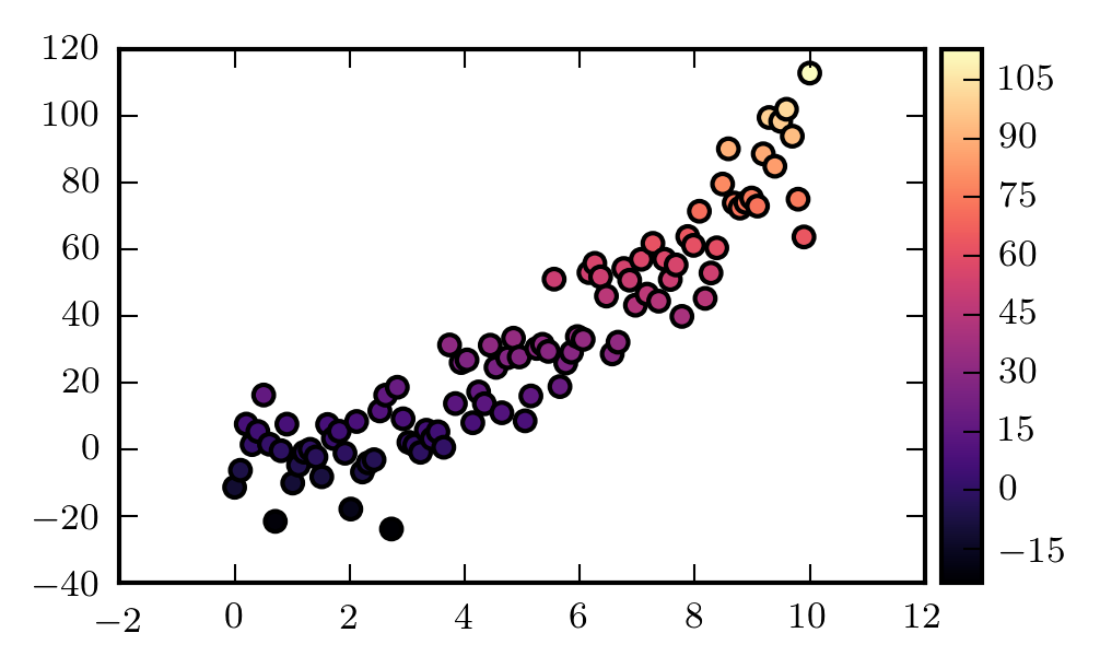
This isn't limited to only images, or only subplots, either. You can use it anywhere you'd call fig.colorbar() or plt.colorbar(). Here's an example with a scatter plot:
x = np.linspace(0, 10, num=100)
y = x ** 2 + 10 * np.random.randn(100)
scatters = plt.scatter(x, y, c=y, cmap='magma')
colorbar(scatters)
<matplotlib.colorbar.Colorbar at 0x106442940>
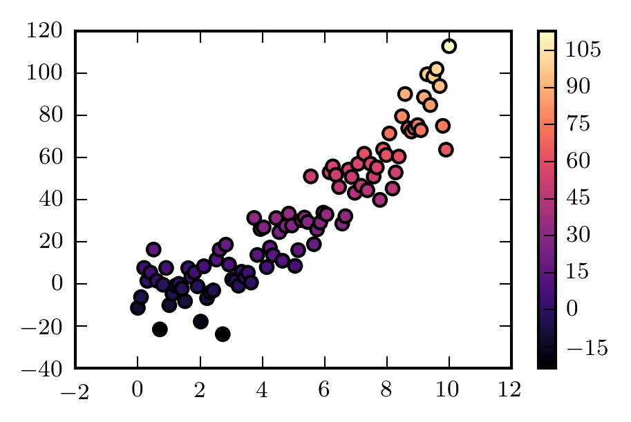
The observant reader will notice that the colorbar is a little stockier than the standard one. This is because it's defined as a percentage of the width of the plot axes. For comparison, here's the standard plt.colorbar():
scatters = plt.scatter(x, y, c=y, cmap='magma')
plt.colorbar()
<matplotlib.colorbar.Colorbar at 0x105c8ceb8>
Hopefully this helps someone else who's getting vexed by their colorbars.