In this post, we will reconstruct a time-varying signal that we can't measure at consistent intervals. A lot of the tools in time-domain signal analysis are derived for continuous signals, with their discrete (digital) forms dependent on consistent sampling. Engineers talk about signaling in terms of frequencies and sample rates, assuming that in the ideal case that you'll have one measurement every $\Delta t$ seconds. (If a measurement is missing, that means your equipment isn't working right.) The well known discrete Fourier transform (and the FFT algorithm) are based on the idea that you're sampling your signal at regular intervals, and can give you unexpected results when you violate that assumption.
On the other hand, when you're looking for signals from outer space, you might set out to measure once a night. But then you have a cloudy night, and miss a data point. And then your allotted telescope time runs out, so you have a gap before you can get more data.
Or a space telescope has to fire its thrusters mid-observation, throwing off a few measurements in your time series. (Which then might inspire you to write a blog post.)
The Lomb-Scargle periodogram
The discrete Fourier transform has the undesirable characteristic of introducing noise at longer periods when the data contains gaps. This can be mitigated slightly by manipulating the data set to "fill in the gaps", but ultimately the Fourier transform is the wrong tool for the job. The technique I'm going to use here comes under the broader category of "least-squares spectral analysis", and is called the Lomb-Scargle periodogram.
As anyone who has fit functions to data knows, the least-squares regression technique is a powerful way to determine the appropriate values for your free parameters. If you had a single sine wave signal, measured at a bunch of different times, you could use a least-squares fit to recover its amplitude and frequency. The Lomb-Scargle technique effectively does this for a spectrum of frequencies of interest, telling you how much power in the signal exists at each frequency. Fortunately, we don't have to implement the specifics ourselves: an optimized implementation exists in SciPy.
Let's set up our notebook.
%pylab inline --no-import-all
import scipy.signal
The implementation we'll be using lives in
scipy.signal.lombscargle. The documentation
provides references to the literature, if you want to read up. The
implementation itself is only a few lines of Cython.
Our input signal
At least to start with, we should use a signal we synthesize ourselves. Then we can be sure we're getting the same thing out as we're putting in, giving us an important sanity check on our code.
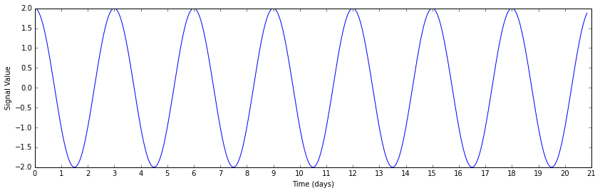
Our input signal will have a period of three days, and a phase offset $\phi$ of $\pi/2$. Below, I define these parameters for our input signal.
# Conversion factors
days_to_seconds = 60 * 60 * 24
seconds_to_days = 1.0 / days_to_seconds

# Signal parameters
A = 2. # amplitude
period = 3 * days_to_seconds # seconds
frequency = 1.0 / period # Hertz
omega = 2. * np.pi * frequency # radians per second
phi = 0.5 * np.pi # radians
Since this is a discretely sampled signal, we also have to define the length of our signal in terms of a number of data points and the spacing between them. (This may seem at odds with the idea that we have gaps in our data. You're right! The gaps are introduced a little later on.)
We make an array of timesteps and a corresponding array signal defined as
$\text{signal}_i = A * \sin ( \omega t_i + \phi )$ for each element i in
timesteps and signal.
N = 1000 # number of samples we're dealing with
dt = 30 * 60 / 1.0 # 30 minutes each sample, ~5e-4 samples / sec

timesteps = np.linspace(0.0, N*dt, N)
signal = A * np.sin(omega * timesteps + phi)
# make some prettier time-axis labels, since timesteps is in seconds
timestep_day_ticks = days_to_seconds * np.arange(22)
timestep_day_labels = ['{}'.format(i) for i in np.arange(22)]

# plot the signal
plt.figure(figsize=(14,4))
plt.plot(timesteps, signal)
plt.xticks(timestep_day_ticks, timestep_day_labels)
plt.xlabel('Time (days)')
plt.ylabel('Signal Value')
A moth-eaten sine wave
To get data that demonstrates the strengths of the Lomb-Scargle periodogram, we
have to take our regularly-sampled signal array and throw out points from it. To
do so, we use numpy.random.rand to generate an array the same length as our
input with uniform random values, and throw out a set fraction of the input
based on the random array element and a threshold.
Here we set frac_points to 0.05, meaning we want to retain 5% of the input
samples for our next step.
frac_points = 0.05 # fraction of points to select

r = np.random.rand(signal.shape[0])
timesteps_subset = timesteps[r >= (1.0 - frac_points)]
signal_subset = signal[r >= (1.0 - frac_points)]
plt.figure(figsize=(14,4))
plt.plot(timesteps, signal, 'k', alpha=0.3, label="Original signal")
plt.plot(timesteps_subset, signal_subset, 'b+', label="Points kept in new signal")
plt.xticks(timestep_day_ticks, timestep_day_labels)
plt.xlabel('Time (days)')
plt.ylabel('Signal Value')
plt.legend()
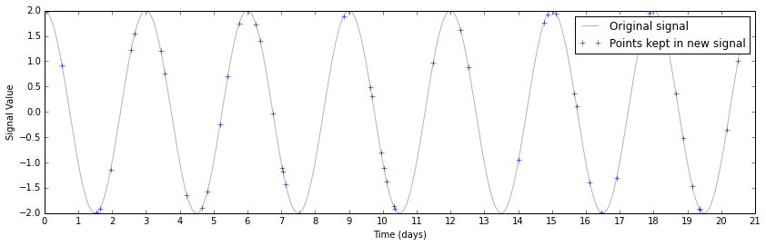
This perhaps makes it a bit too easy to see the underlying sine wave. If you were taking these data, and didn't know a priori what you were looking for, you'd probably have a plot that looked like this instead.
plt.figure(figsize=(14,4))
plt.plot(timesteps_subset, signal_subset, 'b+')
plt.xticks(timestep_day_ticks, timestep_day_labels)
plt.xlabel('Time (days)')
plt.ylabel('Signal Value')
plt.ylim(-4, 4)
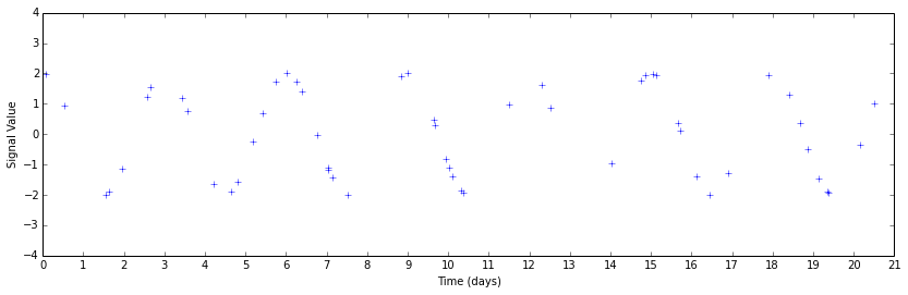
Perhaps you can guess that there's some periodicity there by looking, but it's much less obvious. This data set is also unnaturally clean by construction. The only signal present above is a sinusoid; real data have systematic errors that will further confound your analysis.
Computing the periodogram
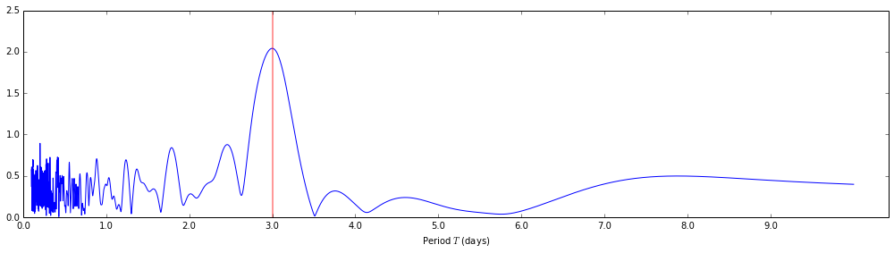
We call scipy.signal.lombscargle with three arguments: x, y, and freqs.
In this case, x and y are given by the timestamps and measurements from our
gap-filled signal array. We generate freqs, the array of angular frequencies
over which the periodogram should be evaluated, by picking 10000 periods in the
range from 0.1 to 10 days and using the relation $\text{Angular Frequency} =
\frac{2 \pi}{\text{Period}}$.
# Choosing points in frequency space depends on what frequencies we think we'll detect.
# There's no point looking for 100 Hz signals when we're looking at T = 3 days periods.

nout = 10000 # number of frequency-space points at which to calculate the signal strength (output)
periods = np.linspace(0.1 * days_to_seconds, 10 * days_to_seconds, nout)
freqs = 1.0 / periods
angular_freqs = 2 * np.pi * freqs
pgram = scipy.signal.lombscargle(timesteps_subset, signal_subset, angular_freqs)
From the documentation, we have one caveat about the output given by
scipy.signal.lombscargle:
The computed periodogram is unnormalized; it takes the value
(A**2) * N/4for a harmonic signal with amplitude A for sufficiently large N.
Therefore, if we want to get out the same amplitude $A$ that we put in, we will have to divide by the number of samples, multiply by four, and take the square- root. In practice, one generally cares more about the frequency than the detected amplitude, so this is not always strictly necessary.
normalized_pgram = np.sqrt(4 * (pgram / signal_subset.shape[0]))
Let's take a look at the normalized periodogram. Below, I'm plotting the
normalized periodogram output against the periods it was evaluated at, instead
of the angular frequencies that were passed to the lombscargle function.
For reference, I've also added a vertical line marking the 3 day period of the input signal.
plt.figure(figsize=(14,4))
plt.plot(periods, normalized_pgram)
plt.xlabel('Period $T$ (days)')
plt.axvline(3 * days_to_seconds, lw=2, color='red', alpha=0.4)
day_ticks, day_labels = np.arange(10) * days_to_seconds, ['{:2.1f}'.format(t) for t in np.arange(10)]
plt.xticks(day_ticks, day_labels)
plt.tight_layout()
Visualizing the detected period
Once you have a periodogram that hints at a periodicity, you will most likely want to "fold" or "phase" the curve (pick your favorite term) to get a better idea of how each observation fits into your attempted fit.
We take a copy of the timesteps_subset array and use the modulus operator to
limit the values to the range [0, 3] days.
timesteps_phased = timesteps_subset.copy()
timesteps_phased = timesteps_phased % (3 * days_to_seconds)
phase_angles = 2 * np.pi * timesteps_phased / (3 * days_to_seconds)
Now we plot the original and phased signals. The plot is color coded so that you can see how the points are rearranged on the (former) time axis to assume the appropriate phase position.
fig = plt.figure(figsize=(14,4))
# Gap-filled data
ax1 = plt.subplot2grid((1,3), (0,0), colspan=2)
ax1.scatter(timesteps_subset, signal_subset, c=timesteps_subset, cmap='rainbow')
ax1.set_xticks(timestep_day_ticks)
ax1.set_xticklabels(timestep_day_labels)
ax1.set_xlabel('Time (days)')
ax1.set_ylabel('Signal Value')
ax1.set_xlim(0, 21 * days_to_seconds)

# Phased data
ax2 = plt.subplot2grid((1,3), (0,2), colspan=1)
ax2.scatter(phase_angles, signal_subset, c=timesteps_subset, cmap='rainbow')
ax2.set_xticks([0, 0.5 * np.pi, np.pi, 1.5 * np.pi, 2 * np.pi], ['0', '$\pi/2$', '$\pi$', '$3\pi/2$', '$2\pi$'])
ax2.set_xlim(0, 2*np.pi)
ax2.set_xlabel('Phase $\phi$ (radians)')
ax2.set_ylabel('Signal Value')
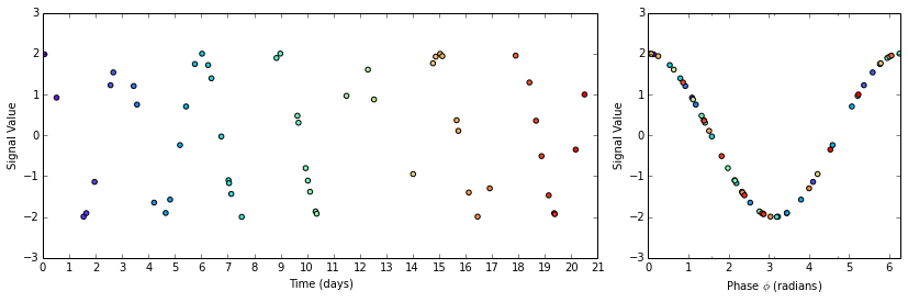
How pretty! Much easier to interpret than that sparsely populated graph of a moth-eaten sine wave.
Hopefully this helped explain how to accomplish something useful to your research. Some more high level descriptions of Lomb-Scargle spectral analysis, as well as other periodograms and when to use them, is online as part of the NASA Exoplanet Archive Periodogram Service documentation. (Bear in mind that they have their own implementation of Lomb-Scargle which may follow different conventions than the SciPy one.)
If you desire more mathematical rigor, in addition to the original paper by Scargle (and the older one by Lomb), there's a treatment (with some useful generalizations) by G. Larry Bretthorst linked below. Thanks to Nick Earl from Space Telescope for sharing it with me.
Further Reading and References
scipy.signal.lombscargle(SciPy documentation)- Least Squares Spectral Analysis (Wikipedia)
- "Frequency Estimation and Generalized Lomb-Scargle Periodograms" (G. Larry Bretthorst, from Statistical Challenges in Astronomy)